|
|
Thinking about a Limited Palette.Why a limited palette? Every artist has their own preferred colours. This is a good pattern to follow. Less is more rings true with my experience. Too many colours in your palette may encourage you to become somewhat lazy. Colours that you mix on the palette or straight onto your painting surface are far more exciting. Mixing Colours ...Mixing colours simply comes with practise. The benefits are:
Using a limited palette ... My recommendation for acrylics is:
I supplement these with green gold, phthalo green, quinacridone magenta, dioxazine purple. When working with acrylic inks and especially when doing mixed media painting the colour palette is much broader. You can follow the links below to learn more about Acrylic Landscape Painting and Mixed Media Landscape Painting.
Colour Choice GuidelinesThe colours you work with are a personal choice. My guidelines are:
Do you like referring back to examples of what you have learnt? Yes... then make notes while you do colour mixing exercises. Also follow the link below to learn more about colour mixing. Learn about Colour Mixing processes. Limited Palette Exercises1. Choose a simple landscape view. Paint this just using one colour-such as ultramarine blue. Create the different tones by varying the amount of water you use.
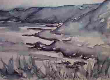
The painting below Coastal View, South Hams is a good example of this.
2. Use two colours that are opposite on the colour wheel. Two complimentary colours. Repeat using two other colours. Note the different effects achieved.
See below how the purple and yellow make a striking combination. 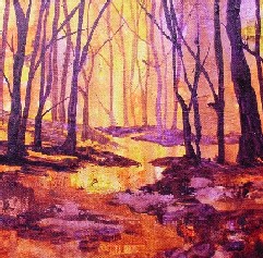
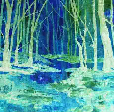
The same scene painted again using harmonious colours of blues and greens is far more gentle. These colours are close to each other on the colour wheel.
3. Restrict yourself to the three primary colours (yellow, blue and red). Paint a familiar landscape using just these colours. Repeat this exercise using different shades of the primary colours and consider the different effects and outcomes.
|
