|
|
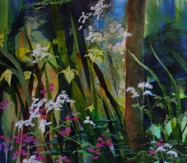
Contrast of Light and DarkIn every painting there are areas of light and dark. These can be indicated by the colours used so in simplistic terms pale yellow next to dark brown. However light and dark can be indicated in the same colour by the tonal value of it. So in the painting below ‘Hidden Treasures’ there is a clever use of different tones of greens which give fascinating contrasts of dark and light.
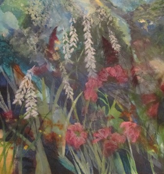
Why Lights and Darks are so ImportantIn landscape painting sometimes there is not much variety of colour. It is the tonal values of lights and darks that give the painting interest and form. In other words the trees in the distance have a three dimensional quality, they have a form because of the shadows -- the lights against the darks. A lack of contrast between darks and lights can make a painting rather flat and uninteresting. In the painting shown here ‘Lost and Found, look at the contrast of tonal values used. Also mask off the light, pure yellow ochre in the left hand corner. Does the painting loose some of its vibrancy and depth? Paintings are very personal but contrasts of darks / lights create a vibrancy and freshness many artists strive towards.
Want more painting rules than the contrast of lights and darks? Then please follow this link! |